The job is not to impress people with AI
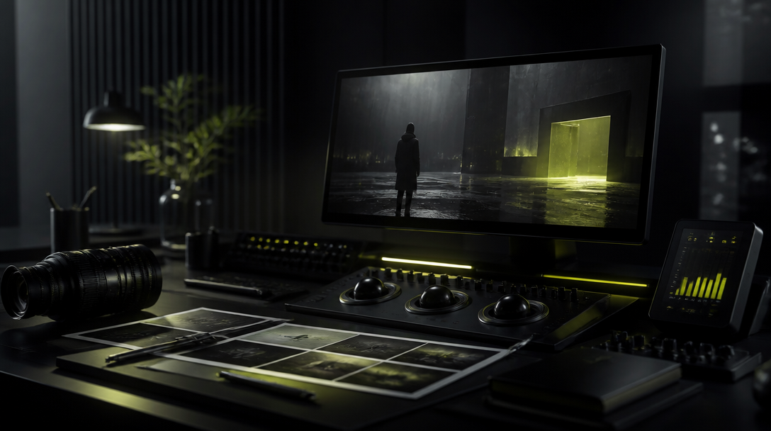
Product launch visuals are not a technology demo. They are campaign film assets.
The viewer should come away thinking:
the product looks desirable,
the brand looks credible,
the launch looks intentional,
the visuals feel expensive enough to trust.
If the visuals instead feel synthetic or overly stylized, the launch loses authority.
Where AI launch visuals create real leverage
AI helps most when the team needs:
faster launch-ready assets,
multiple variants,
concept exploration before physical production,
strong hero images for landing pages,
campaign visuals that would otherwise take too long to capture traditionally.
That leverage is useful because launches often move faster than production timelines.
The realism problem
The most common reason AI launch visuals fail is not lack of polish. It is broken realism.
That can show up as:
impossible reflections,
incorrect material response,
wrong scale,
floating or unsupported objects,
lighting that does not match the environment,
surfaces that look too clean, too plastic, or too generic.
If the product physics are wrong, the brand trust drops immediately.
The 5 realism checks
Use these checks before any product visual is approved:
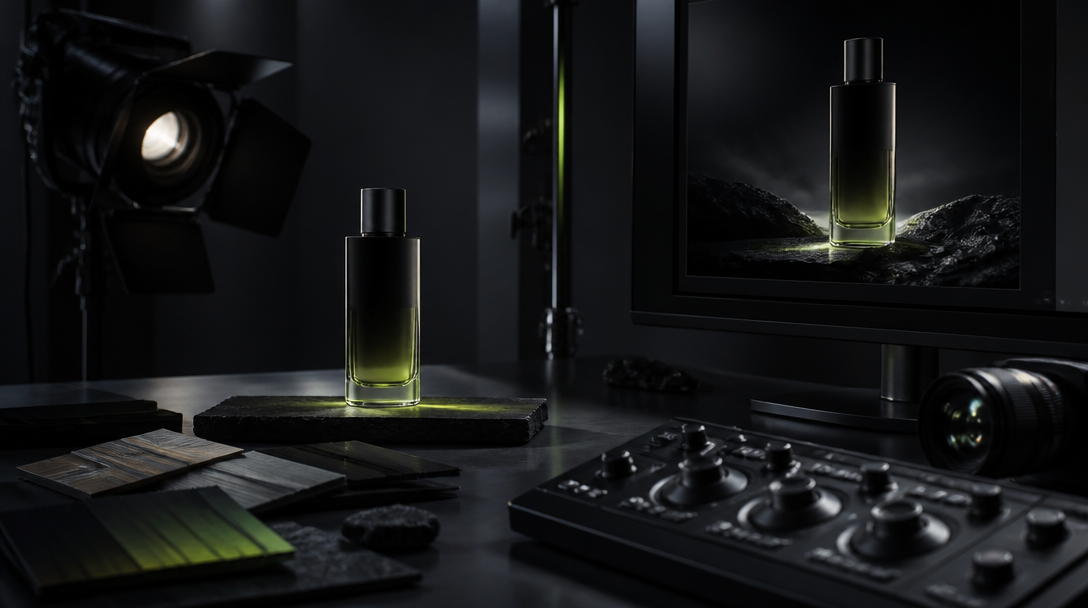
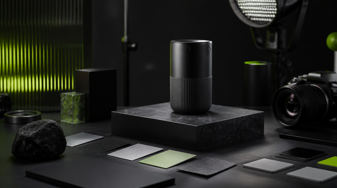
1. Material truth
Does the product feel like the actual material?
Metal should read like metal. Glass should read like glass. Fabric should not look like molded plastic.
2. Lighting truth
Does the light behave consistently?
The light direction, softness, shadow behavior, and reflection logic must all agree.
3. Scale truth
Does the product occupy space correctly?
A visually strong image can still feel wrong if the scale cues are off.
4. Context truth
Does the environment support the product story?
The setting should make the product feel plausible and desirable, not disconnected from the category.
5. Variant truth
Do alternate versions still feel like the same product?
If each image looks like a different object, the launch will feel unstable.
The 4-stage launch workflow
Stage 1: Define the launch role
Ask what the visuals must do.
Examples:
hero image for the landing page,
social teaser,
ad variant,
packaging support,
product detail reinforcement,
campaign opener.
The role determines the style.
Stage 2: Lock the product truth
Before generating anything, lock:
shape,
proportions,
key materials,
brand colors,
must-show details,
must-hide weaknesses.
This is where the product stays recognizably itself.
Stage 3: Explore controlled directions
Use AI to test only the directions that make strategic sense.
Good exploration is selective:
premium minimal,
atmospheric editorial,
technical and precise,
aspirational lifestyle,
campaign-led hero framing.
Do not explore everything. Explore the range that actually fits the launch.
Stage 4: Build the asset set
Once the hero direction works, create the supporting system:
main hero,
secondary crop variants,
social-first adaptation,
detail shots,
contextual scenes,
simple utility assets if needed.
That is how launch assets compound instead of existing as one-off images.
What to avoid
Anti-pattern 1: Over-styling the product
If the visual treatment overwhelms the product, the launch stops feeling like a product story.
Anti-pattern 2: Using AI to hide weak product understanding
The tool cannot fix a launch team that does not understand what the product should communicate.
Anti-pattern 3: Generating too many variants too early
That creates more selection work and usually more confusion.
Anti-pattern 4: Ignoring the category language
The product still has to feel native to its market. Novelty is not enough.
Anti-pattern 5: Treating launch visuals like isolated art pieces
Every image should support the same launch logic.
A practical example
Imagine a premium consumer product launch.
The team wants:
a hero image for the launch page,
three ad variants,
social crops,
a few detail frames for supporting copy.
The bad workflow is to generate a large batch and hope the best frames emerge.
The better workflow is to:
lock the product truth,
choose one launch mood,
define the exact role of each asset,
generate a small set of controlled directions,
select only the frames that protect realism and premium feel,
adapt the winning direction into the rest of the launch set.
That keeps speed and quality aligned.
Why this matters for the brand
Launch visuals are often the first serious proof of product quality that a buyer sees.
If the visuals feel fake:
trust weakens,
the premium signal drops,
the launch feels rushed,
the brand looks less established than it might actually be.
If the visuals feel controlled and believable:
the product feels more desirable,
the brand feels more mature,
the launch becomes easier to support across channels.
Practical checklist
Define the launch role of every asset.
Lock product shape, material, and color truth.
Keep exploration selective.
Judge output by realism and campaign usefulness.
Build the support assets only after the hero direction works.
Avoid over-stylization that weakens trust.
Make every variant feel like part of one launch system.
Closing thought
AI launch visuals are valuable when they help a team move faster without asking the audience to forgive obvious visual mistakes.
The best launch visuals do not call attention to the technology. They call attention to the product.
When a launch needs speed, multiple variants, or hero assets before full physical production is practical.
Next move